Echarts中饼状图的使用

先上效果图:
Echarts中饼状图的使用

1.首先去官网下载echarts.min.js,并引入项目
2.为 ECharts 准备一个具备大小(宽高)的 容器


3.js构造饼图,js代码如下:

var myChart = echarts.init(document.getElementById('main'));
       option = {
    		    title: {//标题组件
                   textStyle: {    
                   color: "#333333",    
                   fontSize: 12,   
                   }
                },
    		    tooltip: {
    		        trigger: 'item',
    		        formatter: "{a} <br/>{b}: {c} ({d}%)",
    		        textStyle:{    //图例文字的样式
                        color:'#fff',  //文字颜色
                        fontSize:10    //文字大小
                    }
    		    },
    		    graphic:[		       	       
    		         {
    		      		type: 'text',              
    		      		top: '40%',           
    		      		left: 'center',          
    		      		style: {
    		      		   text: '10000.00',      
    		      		   fill: '#333333',       
    		      		   fontSize: 20,          
    		      		   fontWeight: 'normal'
    		      		}  		      		        
    		      	},{
    		      		type: 'text',              
    		      		top: '53%',           
    		      		left: 'center',          
    		      		style: {
    		      		   text: '实发工资',      
    		      		   fill: '#A6A8B6',       
    		      		   fontSize: 12,          
    		      		   fontWeight: 'normal'
    		      		}  		      		        
    		      	},      
    		    ],
    		    //圆环的颜色
    		    color:['#48cda6','#fd87fb','#11abff','#ffdf6f','#968ade'],
    		    // 图例
    		    legend: {
    		    	// 图例选择的模式,控制是否可以通过点击图例改变系列的显示状态。默认开启图例选择,可以设成 false 关闭。
    		    	selectedMode: true, 
    		        /* orient: 'vertical', */
    		       /*  x : 'right',   //图例显示在右边
                    y: 'center',  */  //图例在垂直方向上面显示居中
                    bottom:0,
                    itemWidth:10,  //图例标记的图形宽度
                    itemHeight:10, //图例标记的图形高度
    		        data:['基本工资','福利奖金','出差补贴','交补话补','岗位工资'],
    		        textStyle:{    //图例文字的样式
                        color:'#A6A8B6',  //文字颜色
                        fontSize:10    //文字大小
                    }
    		    },   		  
    		    series: [
    		        {
    		            name:'工资占比图',//代表a的值,系列名称
    		            type:'pie',
    		            center:['50%','45%'], //饼图的中心(圆心)坐标,数组的第一项是横坐标,第二项是纵坐标。
    		            radius: ['45%', '60%'],//饼图的半径,数组的第一项是内半径,第二项是外半径。[ default: [0, '75%'] ]
    		            avoidLabelOverlap: false,
    		           /*  animation: false, */  //是否禁用动画效果
    		            label: {
    		                normal: {
    		                    show: true,//是否显示标签
    		                    //// 标签的位置。'outside'饼图扇区外侧,通过视觉引导线连到相应的扇区。'inside','inner' 同 'inside',饼图扇区内部。'center'在饼图中心位置。
    		                    position: 'left',
    		                    //显示的标签的内容
    		                    //a(系列名称),b(数据项名称),c(数值), d(百分比)
    		                    formatter: "{a},{b}:{c}({d}%)",
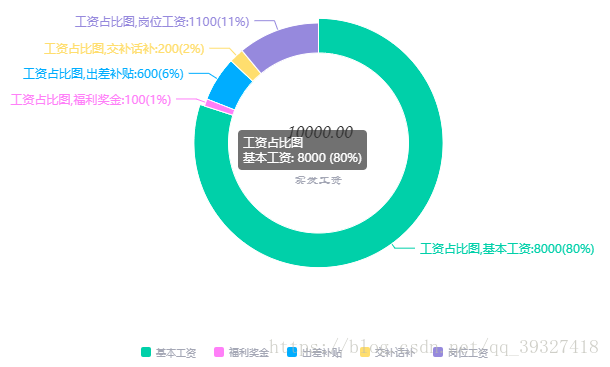
   ![在这里插入图片描述](https://img-blog.csdn.net/2018101313580390?watermark/2/text/aHR0cHM6Ly9ibG9nLmNzZG4ubmV0L3FxXzM5MzI3NDE4/font/5a6L5L2T/fontsize/400/fill/I0JBQkFCMA==/dissolve/70)
   		                    
    		                },
    		                emphasis: {
    		                	//鼠标放在圆环上显示的标签样式
    		                    show: true,
    		                    textStyle: {
    		                        fontSize: '12',
    		                        fontWeight: 'bold'
    		                    }
    		                }
    		            },
    		            labelLine: {
    		                normal: {
    		                    show: true,//是否显示引导线
  	               		        length:10,  //百分比引导线
  	               		        length2:20    //视觉引导项第二段的长度。
    		                }
    		            },
    		            itemStyle: {
                            normal: {
                                borderColor: "#FFFFFF", 
                                borderWidth: 1, 
                                label:{  
                                    show:true,  
                                    formatter:'{d}%'  
                                },  
                            }
                        },
                        // 系列中的数据内容数组。
    		            data:[
    		                {value:8000, name:'基本工资'},
    		                {value:100, name:'福利奖金'},
    		                {value:600, name:'出差补贴'},
    		                {value:200, name:'交补话补'},
    		                {value:1100, name:'岗位工资'}
    		            ]
    		        }
    		    ]
    		};
       myChart.setOption(option);